
Data Visualization tools put the analyzed data in the form of visuals i.e – graphs, images. These visualizations make it easy for users to understand the analyzed trends through visuals.
Data Visualization tools are necessary when it comes to analyzing big datasets. When data scientists analyze complex datasets they also require to understand the insights collected. Data Visualization tools will make it easier for them to understand through visuals i.e. graphs and charts.
Sisense
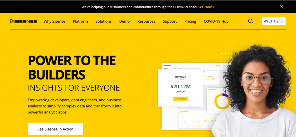
Sisense is a business intelligence-based data visualization system and it provides various tools that allow data analysts to simplify complex data and obtain insights for their organization and outsiders. Sisense believes that eventually, every company will be a data-driven company and every product will be related to data in some way. Therefore it tries its best to provide various data analytics tools to business teams and data analytics so that they can help make their companies the data-driven companies of the future.
It is very easy to set up and learn Sisense. It can be easily installed within a minute and data analysts can get their work done and obtain results instantly. Sisense also allows its users to export their files in multiple formats such as PPT, Excel, MS Word, PDF, etc. Sisense also provides full-time customer support services whenever users face any issues. A price quote can be obtained by submitting a form.
Key Features of Sisense System
- It helps you to mash up data and create an analytics app.
- You can embed analytics anywhere with a customizable feature.
- You can deploy your work on the cloud using Windows or Linux.
- Sisense enables you to specify access rights to users.
- You can recover your data anytime and safeguard against errors.
Looker
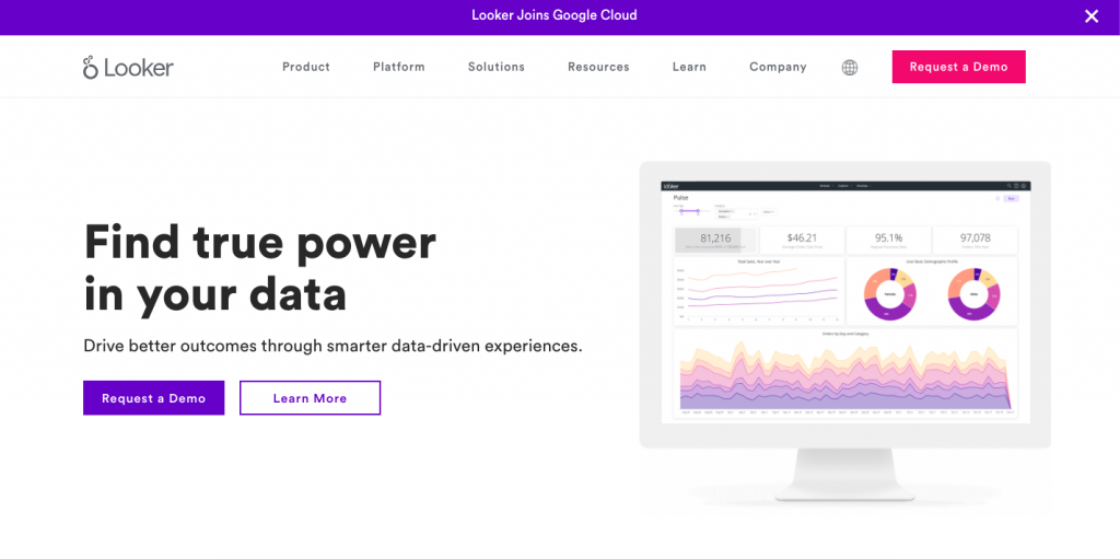
Looker is a forerunner of a new generation of data visualization tools, aimed at putting analytics and dashboarding in the hands of employees throughout an organization, rather than the sole preserve of data scientists. It offers a huge library of clear and colourful templates that can be applied to your data, allowing you to experiment with different methods of presentation. Dashboards can be set up for multiple user types, so customers, staff, partners, or management teams all see what’s important to them.
Key Features of Looker System
- It provides a dashboard to analyze your data deeply.
- You can filter individuals or groups dynamically.
- Looker helps you to combine numerous types of charts.
- You can visualize data with subtotal in tables.
- This app provides a modern API to integrate workflow.
Zoho Analytics
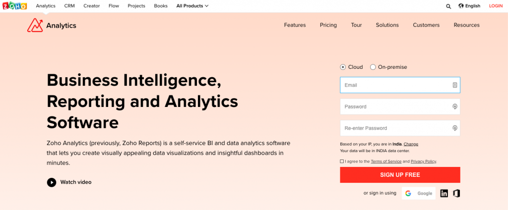
Zoho Analytics is probably one of the most popular BI tools on this list. One thing you can stay assured of is that with Zoho analytics, you can upload your data securely. Moreover, you can use a wide variety of charts, tables, and components to transform your data into a concise manner.
Zoho Analytics caters to huge enterprises, including Bajaj Allianz, Maruti Suzuki, HP, Hyundai Motors, and HDFC. However, it’s suitable for mid-sized businesses as well.
Key Features of Zoho Analytics
- Provides extensive customer support, which comes in handy for a beginner.
- It allows you to easily embed your reports and dashboards on websites and social media channels.
- Extracts data from multiple resources and then process it to create insightful reports.
- It comes with an AI-based assistant to assist you in your data visualization process.
- Space quota availability is good enough for a bigger database.
Tableau
Tableau is one of the best interactive data visualization tools. It helps people transform data into actionable insights that make an impact. Users can easily connect to data stored nearly anywhere, in nearly any format. The drag and drop feature helps you create interactive dashboards with advanced visual analytics. With Tableau, you can create charts, maps, graphs, and several other graphics. The company also gives users the option of installing the software on their own computer or cloud hosting the platform on Tableau’s server.
Key Features of Tableau System
- The moderate speed with options to optimize and enhance the progress of an operation.
- It provides extensive options to secure data without scripting.
- This app comes with different versions, such as the Tableau server, cloud, and desktop.
- It can be integrated with more than 250 applications.
- Tableau helps you to resolve big data-related issues.
Domo
Domo is a business intelligence model that contains multiple data visualization tools that provide a consolidated platform where you can perform data analysis and then create interactive data visualizations that allow other people to easily understand your data conclusions. You can combine cards, text, and images in the Domo dashboard so that you can guide other people through the data while telling a data story as they go.
Key Features of Domo System
- Domo allows you to customize text, images, and colour.
- It enables you to set up customized alerts.
- This tool automatically monitors your data correlations, summaries, and more.
- You can integrate it with any software.
- Personalization of the dashboard is possible.
Microsoft Power BI
Microsoft’s industry-standard business analytics platform offers some very useful and intuitive data visualization functionality. Microsoft PowerBI makes it simple for someone with no prior experience to start creating interactive dashboards and charts from their enterprise data. As with all of Microsoft’s cloud business services, it is designed to allow teams to work collaboratively on data projects. It also allows queries to be made in natural, conversational language with the results quickly rendered in clear and eye-catching graphics. PowerBI comes with a good range of templates and visualization options, with new ones available either for free or for purchase on Microsoft’s Azure marketplace. It is also available in a free version, and affordable in its enterprise version, starting from $10 per license.
Key Features of Microsoft Power BI
- Microsoft Power BI gives you real-time updates on the dashboard.
- It provides a secure and reliable connection to your data sources in the cloud or on-premise.
- Allows data exploration using natural language query
- Offers feature for dashboard visualization regularly updated with the community.
- It is easy to use hybrid configuration.
QlikView
QlikView is a software similar to a tableau but you need to pay before using it for commercial purposes. It is a business intelligence platform that turns data into useful information.
This software helps to improve the data visualization process. The tool is preferred by well-established data scientists to analyze large scale data. Qlikview is used across 100 countries and has a very strong community.
Key Features of QlikView System
- It provides transparent reporting and scalability with data integration.
- Automatically maintains data association.
- It offers the fast integration of data from various sources into a single application.
- Qlik provides data visualization in a meaningful and innovative way.
- It helps you to identify trends and information to make any decisions.
Klipfolio
Klipfolio is a Canadian business intelligence company that provides one of the best data visualization tools. You can access your data from hundreds of different data sources like spreadsheets, databases, files, and web services applications by using connectors. Klipfolio also allows you to create custom drag-and-drop data visualizations wherein you can choose from different options like charts, graphs, scatter plots, etc.
Key Features of Klipfolio Tool
- Klipfolio also has tools you can use to execute complex formulas that can solve challenging data problems.
- It has a bunch of templates in its stock, and also it allows users to create a customized dashboard based on their choice.
- As it is connected to 500 different sources of data, users can get the desired data whenever they want from wherever they want.
- Decision-makers use klipfolio to understand business growth and what steps they should take in the future.
- Klipfolio offers a free trial of 14 days, and users can access as much as they want in these 14 days.
SAP Analytics Cloud
SAP Analytics Cloud uses BI and data analytics capabilities to help you evaluate your data and create visualizations in order to predict business outcomes. It also provides you with the latest data visualization tools that help you by alerting you of possible errors in the data and categorizing different data measures and dimensions. SAP Analytics Cloud also suggests Smart Transformations to the data that lead to enhanced visualizations.
Key Features of SAP Cloud
- It gives the surety of security every data on which users worked on this program.
- This data visualization tool comes with a feature of importation and exportation files or data.
- It has an option of free trial for 30 days so that users can understand first if they can use it or not.
- It has considerable pricing for its user, i.e. $22 per month. This is cheaper than most other programs.
IBM Cognos Analytics
IBM Cognos Analytics is an Artificial Intelligence-based BI platform that supports data analytics among other things. Users can visualize as well as analyze their data and share actionable insights with anyone in their company. Even if users have limited or no knowledge about data analytics, they can use IBM Cognos Analytics easily as it interprets the data for users and presents you with actionable insights in simple language.
Key Features of IBM Analytics
- It allows users to integrate data from more than one source to let users feel flexible enough.
- It allows users to customize their reports following their choice or company’s demand.
- This tool can be a simpler one for beginners, but it is so influential for the professionals.
- It provides a free trial for 30 days followed by a plan Starting at A$20.87 per month.
Kibana
Kibana is one of the best data visualization tools for mainly time series analysis, which means it gives the analysis of data analyzed in a specific time. It is helpful in many ways for this feature as it provides time to time data about a business or company.
Key Features of Kibana Tool
- It has a new feature called Elastic Stack, which enables searching any data from anywhere in any format.
- It can detect any dissonance and any spoofy thing in data, which makes it exceptional than other tools.
- Kibana can easily find and detect relations within every data and gives a visual to the user, which is also a unique feature.
- Like other data visualization tools, Kibana also allows dashboard sharing with collaborators for fluent workflow.
Plotly
Plotly is a popular and one of the most powerful data visualization tools that display information by building interactive graphs based on web browsers, creating dozens of beautiful charts and maps. It offers some charts you cannot find in most packages, like contour plots, candlestick charts, and 3D charts. The team of Plotly maintains the fastest-growing open-source visualization libraries for R, Python, and JavaScript. They also provide modern rich analytics apps in Python for the Enterprise.
Key Features of Plotly Tool
- Plotly supports drag and drop functionalities.
- One can easily search for a wide range of charts and templates.
- This tool help users to compose publication-quality figures without writing a single line of code.
- It can be integrated with the existing workflow of your company.
- It helps users to manage privacy.
Chartio
Chartio is one of the best cloud-based data visualization tools that is ideal for gaining insights with your company’s data. The powerful interface is an excellent source for all your most critical metrics. Companies like DoorDash, Udacity, Squarespace, and Shazam all use Chartio to stay informed.
This platform is perfect for team collaboration across every department in your organization. Your sales teams, project managers, and customer success representatives can all create custom charts and dashboards without having to rely on engineers or data analysts.
Key Features of Chartio Environment
- Chartio is available for all types of businesses.
- Chartio is easier to learn.
- It comes with a free trial option for the new users so that users can come to know about its basic features.
- Chartio has three types of pricing options, namely Startup, Growth, and Premium, and price varies in each option.
Infogram
Infogram is a dedicated visualization tool geared towards creating charts, presentations, and dashboards for enterprise use. A simple drag-and-drop interface lets you quickly build documents or slides packed with graphical information. Its collaborative-working elements are particularly strong, enabling teams to experiment with different data representations in different ways to see what works best. If you need a dashboarding tool specifically designed for infographics, charts, slides, and maps, to plug into an existing analytics platform, Infogram is worth a look.
Key Features of Infogram
- It has an easy-to-use drag-and-drop builder that non-technical users can figure out.
- You can create custom templates with colours, fonts, and logos that match your company’s brand image.
- Aside from being useful for corporates and government bodies, it is incredibly student-friendly as well.
- Infogram has a pricing of $19 per month though it has another free version.
- It offers an ample variety of images, icons, and flags. Proper sets of maps and charts are present.
Highcharts
Highcharts is an open-source charting library written in JavaScript that makes it easy to add interactive charts to websites or web applications and is available for free for personal learning, personal websites and non-commercial use. What’s more, Highcharts is more compatible than D3.js and can be used on all mobile devices and browsers on your computer, using SVG in modern browsers and VML in lower versions of the IE browser for graphics drawing. If you want to run Highcharts on a commercial or governmental website, intranet or project, you need to purchases licenses along with premium support.
Key Features of Highcharts
- On Highcharts, charts can be imported in any format such as PDF or JPG, etc.
- Highcharts offers a lot of different types of charts and supports line, spline, area, areaspline, column, and more.
- One can use Highcharts to show different types of Analytics easily.
- It is dynamic in nature and allows you to add, remove, or modify series and points.
- Compatible all types of devices, including smartphones, tablets, desktop, and more.
Visme
Visme is a well-known data visualization tool that is used for making presentations and visualizations. Visme offers a huge amount of photos, icons, templates, and fonts for users to make presentations, graphics, charts, and reports. Social media (e.g. Instagram, YouTube, etc.) graphics could be created within 3 steps with dynamic images and real-time data. With Visme, you can view and present your content anytime from anywhere on any device. Besides, it provides education discounts and non-profits discounts.
Key Features of Visme Analytics
- Visme lets you turn your data into engaging presentations, infographics, charts, widgets and videos.
- Visme costs $12 per month per user, which is so much cheaper than other data visualization tools.
- If you are not happy with a stock template, you have the option to edit it, and there are plenty of templates to choose from.
- These presentation based data can be integrated into any applications available by MS Office.
- You also have the ability to make your graphics interactive by adding buttons and links, and they can be turned into files and published online.
Geckoboard
Geckoboard is an online-based data visualization tool for collecting and sharing your data that was launched in the year 2011 in the UK. It is an advanced data visualization tool that helps decision-makers of a company to set a goal with a dream to reach the goal within a particular time. Geckoboard keeps users always up to date. You can choose from over 80 pre-built different services for real-time analysis.
Key Features of Geckoboard
- The platform also gives you an API for custom widgets and branding options.
- It has the technology of capturing the actual data and process it to convert it into a rhythm.
- You can add your own logo and completely personalize the data and dashboard.
- You can share your data with several platforms, including Google Analytics and Salesforce.
- Users can choose which metrics are the focus of each of your reports.
AnyChart
AnyChart is a data visualization tool in which users can make a visual of charts and connect that with any other destination. It is popular for its great and fast data analysis and built-in graphically attractive charts. A viewer can easily get engaged with the presented charts made with AnyChart.
Key Features of AnyChart Solution
- AnyChart has a wide variety of charts that are engaging, interactive, and attractive.
- It lets users share analyzed, edited and organized data with anyone and anywhere.
- AnyChart costs $79 per user, which is higher than most other data visualization tools.
- AnyChart offers training facilities to beginners if required.
FusionCharts
FusionCharts is a JavaScript library for data visualization. It was launched in 2002, and till now more than 8 lakh developers have used it and using it all over the world. The software includes 100+ interactive charts and 1,400+ data-driven maps. This includes popular charts such as bar, column, line, area, and pie. The software integrates with any JavaScript framework or server-side programming language.
Key Features of FusionCharts
- It enables you to integrate with JavaScript framework or server-side programming language.
- Fusioncharts helps you to build charts with real-world data.
- Supports all browsers, including IE 6,7, and 8.
- It provides ready-made dashboards to start your work.
- This library allows you to export the result in bulk.
ChartBlock
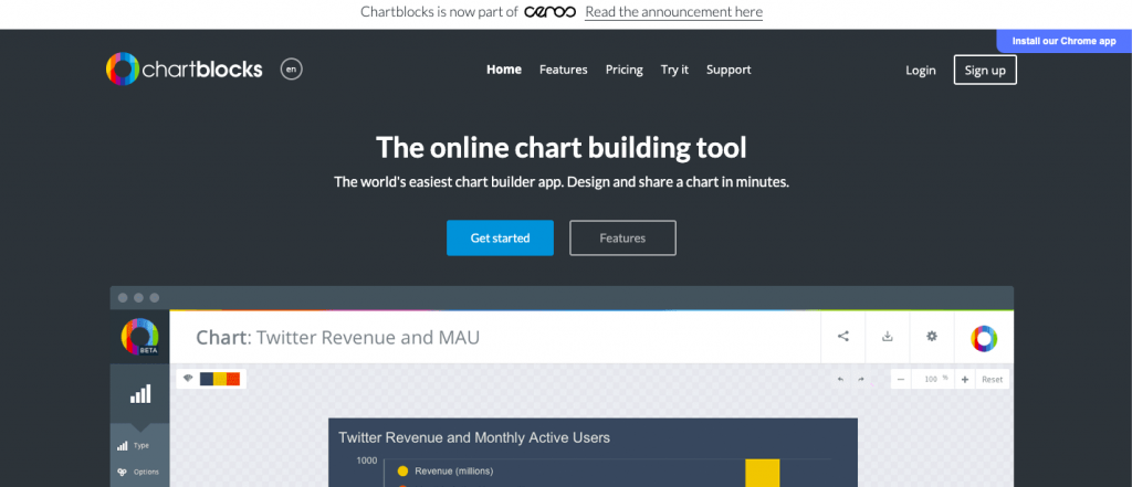
ChartBlocks is a simple online chart creating tool, and its data import wizard can lead you step-by-step to show you how to import data and design charts. Unlike RAWGraphs, users can easily share their charts on social media. Users can also export charts as editable vector graphics or embed charts into websites with a free personal account. Professional accounts and elite accounts are also offered.
Key Features of ChartBlock
- It is free and reasonably priced paid plans are available.
- It is easy to use wizards for importing the necessary data.
- Charts are well designed with a huge number of options.
- Able to use the same data set to make multiple charts.
- This tool enables you to import data from spreadsheets, databases, etc.
Datawrapper
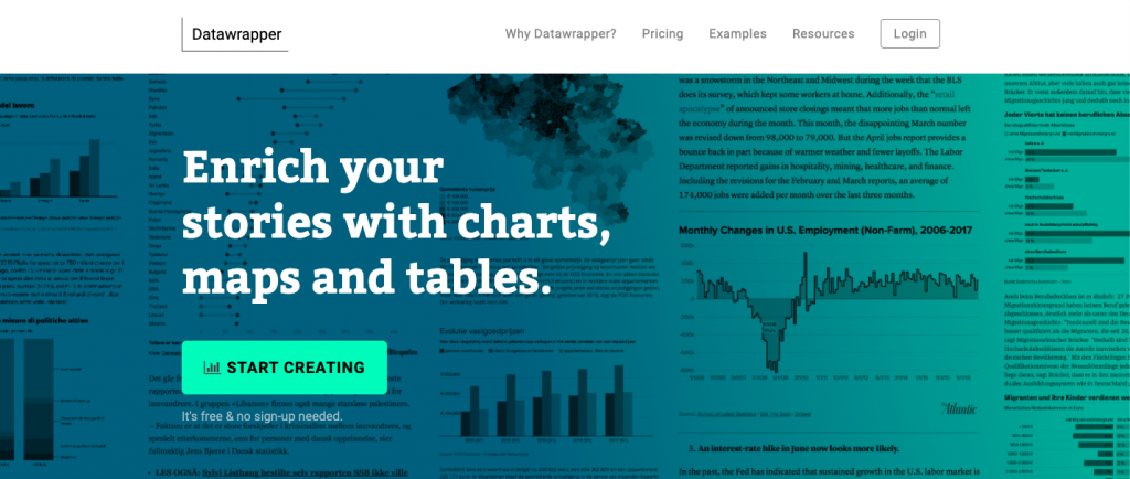
Datawrapper is one of excellent data visualization tools in this list. Your target audience should be able to understand whatever type of chart you create. Moreover, the excel screenshot looks quite good on your desktop, but it’s barely readable from a mobile.
And Datawrapper solves this issue automatically. All the charts, tables, and maps you create with DataWrapper are easily readable on all devices. The good news is that you don’t need any coding skills to create the charts.
Key Features of Datawrapper
- It is specifically designed for newsroom data visualization.
- The tool includes a built-in colour blindness checker.
- Datawrapper supports Linux, Mac, and Windows operating systems.
- It helps you to create maps, charts, and tables.
- This tool enables you to connect your visualization to a Google Sheet.
D3.js
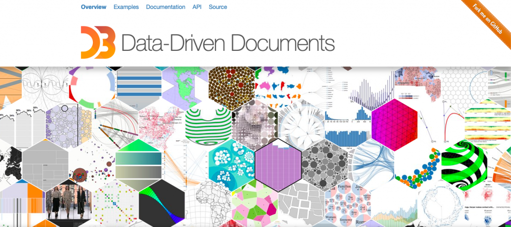
D3.js is an open-source JavaScript library for manipulating documents based on data, using HTML, CSS, and SVG, and is regarding as the top JavaScript visualization framework. Getting started to learn D3.js is complicated, but D3.js is really powerful and flexible and worth learning deeply. Remember that D3.js cannot display graphs in lower versions of the IE browser.
Key Features of D3.js
- Elegant and easy to extend
- A huge number of chart types possible.
- A focus on web standards.
- Tools available to let non-programmers create visualizations.
Google Charts
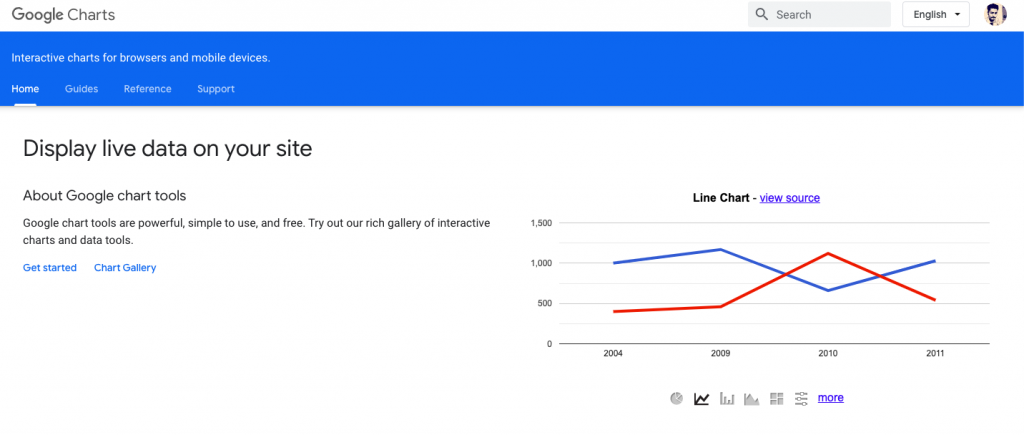
Google Charts is a great place to start your exploration of the possibilities of data visualization. It’s totally free to use and lets you quickly start creating graphical representations of your data and building interactive dashboards. It can output HTML 5, so your visualizations and dashboards can be built into any website, and although it is very simple to use, it gives you access to the same tools that Google use themselves for their own analytics and development operations, so it’s also flexible and powerful.
Key Features of Google Charts
- It is free to access.
- Ability to pull data from multiple sources.
- Wide variety of chart formats available.
- Cross-browser compatible since it uses HTML5/SVG.
- Works with dynamic data.
Grafana
Grafana is an open-source data visualization software that lets users create dynamic dashboards and other visualizations. It supports mixed data sources, annotations, and customizable alert functions, and it can be extended via hundreds of available plugins. That makes it one of the most powerful data visualization tools available.
Key Features of Grafana
- Open source, with free and paid options available.
- Large selection of data sources available.
- Variety of chart types available.
- Makes creating dynamic dashboards simple.