
In this article, we’re going to draw various types of charts and graphs using Python. We’re going to use two different packages in Python whiPython is a famous programming language. It is a very resourceful programming language with its functions being applied almost across all fields in IT, such include Data science, web development AI and Big data.
Having a powerful programming tool is not enough; the ease of use comes in handy when developing or computing complex computations. In Python, it is easy for your implementation and output to make sense easily.
How about visualization? Which is the topic of today. In the scenario where you have data, you need charts and graphs implemented for the simple to the most complex data. Can Python help you with that?
Yes, it can. Python has many user-friendly and open source libraries which support all types of drawings, charts, and graphs you need. Such libraries include Matplotlib, Plotly, Seaborn, Bokeh.
In this article, the focus is on how to create various charts and graphs between Matplotlib, and Plotly we will be able to differentiate the best practices for both methods to ensure you gain accurate results and outputs. Let’s have a look.
Prerequisites
Charts cannot be drawn in a python command interface hence the need for a good visualization integrated IDE to display your generated visualization; common IDEs for Python are PyCharm and Jupyter notebook in the case for visualizations, I recommend using Jupyter notebook to draw various types of charts and graphs using python.
Since we’re going to create charts and graphs using two different methods, therefore, we need two different modules to draw various types of charts and graphs using python:
python3 -m pip install matplotlib
python3 -m pip install plotly
Method -1: Creating Charts and Graphs using Matplotlib
Matplotlib is a very extensive library. Matplotlin was created as the graphical user interface for a program named MATLAB. Engineers and data scientists primarily use MATLAB, although it also works well with Python.
Matplotlib plot has various key parts this includes:
- AXIS: These are X and Y using .xlabel() and .ylabel() functions for 3d charts they may have more axis.
- Title: created using the title() function represents the header/title of the plot.
- Legend: this is a key for the labels used.
These are standard parts for various charts and graphs, as displayed later in this article. Now, let’s look at the various charts and graphs one can develop using Matplotlib.
Read Also: Uninstall Python on Windows, Linux, or Mac
Create Bar Charts Using Matplotlib
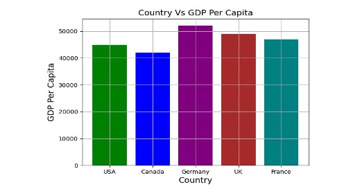
A bar chart is a type of visualization that usually represents a change in the value of a variable compared to the proportion of different relatable categories of another variable, in this case, to explain further, we will use the gross domestic product of different countries to display how to create a bar chart using matplotlib.
import matplotlib.pyplot as plt
import pandas as pd

Data = {'Country': ['USA','Canada','Germany','UK','France'],
        'GDP_Per_Capita': [45000,42000,52000,49000,47000]
       }
df = pd.DataFrame(Data,columns=['Country','GDP_Per_Capita'])

New_Colors = ['green','blue','purple','brown','teal']
plt.bar(df['Country'], df['GDP_Per_Capita'], color=New_Colors)
plt.title('Country Vs GDP Per Capita', fontsize=14)
plt.xlabel('Country', fontsize=14)
plt.ylabel('GDP Per Capita', fontsize=14)
plt.grid(True)
plt.show()
Code Explanation:
After importing the library, we have defined a dictionary with keys Country and GDP_Per_Capita which will become the X and Y-axis of the chart. After that, we’re creating the data frame using that dictionary.
In the next line, we’re defining the colors which we’ll use in our chart. Now we need to pass these data to the matplotlib. After defining the title, label, and enabling the grid we’re using plt.show() to display the output.
Output:
Create Piecharts Using Matplotlib
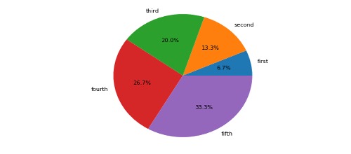
A pie chart is a good visualization tool to determine the proportion of a value in whole data; in a pie chart, the values are divided according to their proportions which all add up to 100% values which take most of the proportion to have more significant percentages than others. A pie chart consists of labels according to the data, percentages, proportions, and values. Have a look at the following implementation and output of a pie chart:
 import matplotlib.pyplot as plt
 import numpy as np

 x = [100, 200, 300, 400, 500]
 labels = ['first', 'second', 'third', 'fourth', 'fifth']

 plt.pie(x,labels=labels,autopct='%1.1f%%')

 plt.show()
The code is very similar to the bar chart’s code but we’re using plt.pie() instead of plt.bar() and not using any axis here.
Output:
Create Histograms Using Matplotlib
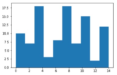
A histogram is a graph that is used to showcase the frequency distribution of variables for this graph it is commonly used with a population in the example used before its how to implement integer frequency distribution histogram using matplotlib.
 import matplotlib.pyplot as plt
 import numpy as np
 x = np.random.randint(low = 0, high = 15, size=100)
 plt.figure()
 plt.hist(x)
 plt.show()
Also Read: How to convert a list into a set in Python
Output:
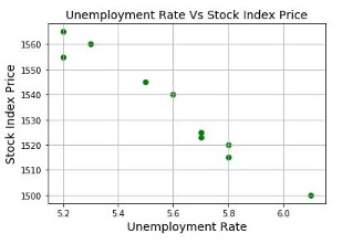
Create Scatter Charts Using Matplotlib
Scatter charts are commonly used in unsupervised learning; they discover relationships and structures that were not previously known; a typical application is for determining customer segmentation.
 import matplotlib.pyplot as plt
 Data = {'Unemployment_Rate': [6.1,5.8,5.7,5.7,5.8,5.6,5.5,5.3,5.2,5.2],
         'Stock_Index_Price': [1500,1520,1525,1523,1515,1540,1545,1560,1555,1565]
        }
 df = DataFrame(Data,columns=['Unemployment_Rate','Stock_Index_Price'])
 plt.scatter(df['Unemployment_Rate'], df['Stock_Index_Price'], color='green')
 plt.title('Unemployment Rate Vs Stock Index Price', fontsize=14)
 plt.xlabel('Unemployment Rate', fontsize=14)
 plt.ylabel('Stock Index Price', fontsize=14)
 plt.grid(True)
 plt.show()
Output:
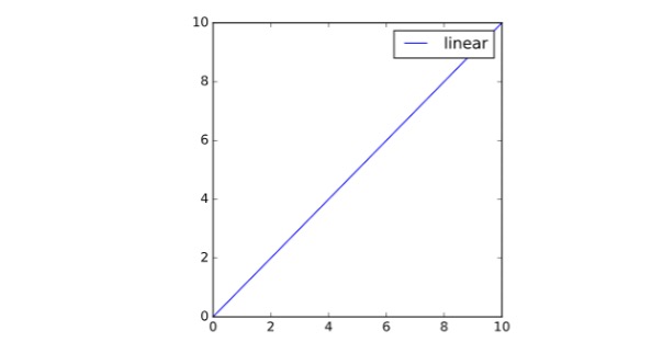
Create Line Charts Using Matplotlib
Do you want to catch trends? A line graph is an exemplary graph for forecasting and catching trends also prevalent for predicting and estimating simulation. Let’s look at how its implemented using matplotlib:
 import matplotlib.pyplot as plt
 import numpy as np
 # Prepare the data
 x = np.linspace(0, 10, 100)
 # Plot the data
 plt.plot(x, x, label='linear')
 # Add a legend
 plt.legend()
 # Show the plot
 plt.show()
Output:
Method -2: How To Create Charts and Graphs Using Plotly
Plotly is an extensive python library well known for its ability to provide interactive Ness to the graphs and visualizations generated; this ability makes it easier to see insights in a better way.
The key features for Plotly library are:
- Unique geospatial diagrams: it uses Map box, which provides inbuilt mapping functionality for shape geo data creating amazing charts.
- Interactive: with its functionality, Plotly can develop interactive charts, especially for sequential data.
- Hovering ability: This provides insights within insights when you hover over a chart.
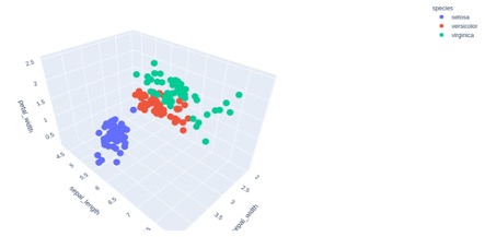
Create a 3D Scatter Chart Using Plotly
The following is an implementation using Plotly for a 3D Scatter Chart:
 import plotly.express as px
 # Data to be plotted
 df = px.data.iris()
 # Plotting the figure
 fig = px.scatter_3d(df, x = 'sepal_width',
                     y = 'sepal_length',
                     z = 'petal_width',
                     color = 'species')
 fig.show()
Output:
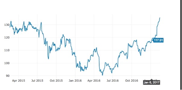
Create Time Series Graph Using Plotly
Plotly is a good python library tool to develop time series. ; this is usually used In financial data where projections, simulations, predictions are made to determine projected sales or prices. Let’s have a look at how to implement a time-series graph using Plotly:
 import plotly
 import plotly.graph_objs as go
 import pandas as pd

 df = pd.read_csv("https://raw.githubusercontent.com/plotly/datasets/master/finance-charts-apple.csv")

 data = [go.Scatter(
           x=df.Date,
           y=df['AAPL.Close'])]

 plotly.offline.plot(data)
Also Read: How to convert list into a set in Python
Output:
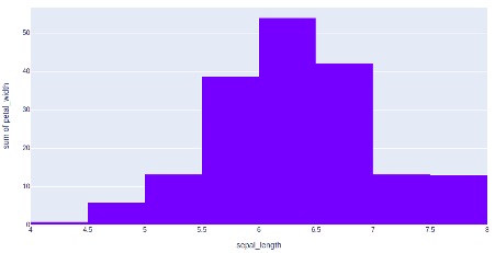
Create Histograms Using Plotly
 import plotly.express as px
 # using the iris dataset
 df = px.data.iris()
 # plotting the histogram
 fig = px.histogram(df, x="sepal_length", y="petal_width")
 # showing the plot
 fig.show()
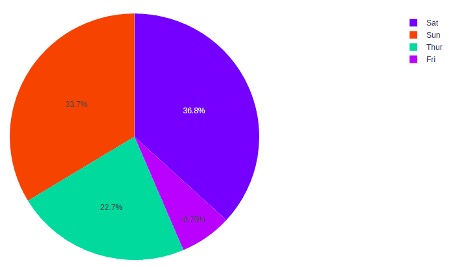
Create Pie Charts Using Plotly
 import plotly.express as px
 # using the tips dataset
 df = px.data.tips()
 # plotting the pie chart
 fig = px.pie(df, values="total_bill", names="day")
 # showing the plot
 fig.show()
Output:
Final Words
Charts and graphs require to be visually represented, hence to develop charts and graphs, an IDE is needed, preferably a Jupyter notebook. Matplotlib is well known for creating basic charts and graphs and providing visualizations. Plotly is a python library that provides better interactivity, hovering, and produces great charts, especially for geospatial data with these unique functions, they generate insights within insights. To draw various types of charts and graphs using Python there are other options also available like you can also use Pandas package to draw various types of charts and graphs using Python.
Here are some useful tutorials that you can read: